I’d like to say that the last item on publishing the book was to choose between which book cover design I liked the most, but this really was no where near the last item I had to do. More accurately it could be described as the last fun item I had to do on the publishing process, the rest of the items involved creating
- both Kindle and paperback versions
- micro checking both versions
- setting up ISBN numbers
- creating publisher accounts
- registering with and reading through eight different contracts with the print on demand supplier (took four days solid)
Fortunantely when I wrote my previous VFX book I had already gone through the whole business of setting up a publishing company and obtaining my EIN – a requirement from the US Inland Revenue Service to qualify for a UK-US tax treaty – thirty four pages of notes to fill out the right boxes on thier form and an hour and a quarter on the phone to an IRS representative – call centres are a breeze after speaking to those guys. That was probably the most painful part of publishing.
If you are interested in the whole publishing process please see my filmmaking and VFX blog where I talk about how to write and publish your book on Amazon
http://digitopiafilm.blogspot.co.uk/2013/03/launching-vfx-book-to-number-1-best.html
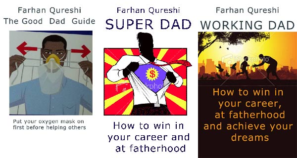
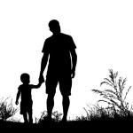
concepts contact sheet left to right: (a) Put your Own Oxygen Mask on First, (b) Super Dad and (c) Working Dad (note images used here for educational/research purposes only)
Though concept A (put your own oxygen mask on first) was an initial inspiration for the book’s message I did find a way to incorporate the image into the inside of the book. I felt though concept B – The Super Dad, was probably the most fun, it didn’t really speak to the subject matter and the title and cover could be ambiguous to what it was leading to both confused readers and me not finding the market of dads that I was looking to help.
I felt that I wanted to book cover and title to be very clear what it is, who it is aimed at and what it will deliver.
No surprise then that concept C was my favourite, afterall I never went on to develop concepts D, E, and F. Having discussed all the options and motivations for my cover I got to work with the excellent Derek Murphy from www.bookcovers.creativindie.com who I found from a personal recommendation from an author friend of mine. Derek provided me with many mock ups on my idea.
Here are the final layouts that we decided upon, the final choice now boiled down to which colour palette we were to use for the book cover design.
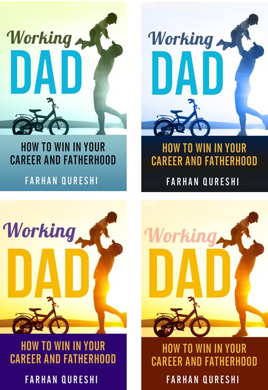
Working Dad book cover designs
This fine detail analysis took almost as much time as choosing the initial concept, although I prefer to work this way, first detailing the broad brush strokes and then digging into the granular detail towards the end.
I then put it out to vote hoping that one would come out as a clear winner
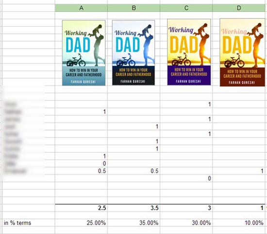
cover design voting results (the two 0.5s should be one row up as the person who voted for design D correctly pointed out)
But as you can see the only thing conclusive was that option D wasn’t going to win (although I hugely respect this artist’s opinion). So it was basically left to me and Derek to choose the final design.
In the next few days the book is going to launch where you’ll be able to see all the efforts of my toil and choices that I made. I hope you’ll enjoy reading it and helping to spread the word to other parents.
Oh yes, one last thing, did I mention that I also unexpectedly lost my job during this period?
On top of all this I was out of work and spent the best part of the day searching for jobs, rewriting CVs and chasing job agents, I’m planning on writing a set of posts about how to deal with job agents. I had also just finished making a movie too, in fact this is the movie that I finished directing while sorting out all these publishing contracts.
All the time trying to be a full time dad too.
Many thanks for reading. Look out for part IV where I talk about designing the business card – taking the conversation offline into the real world.
Also see writing journey part I: Why I’m writing a book
and writing journey part II: Deciding on the best concept for the book cover design
[Tweet “choosing a #bookCover #design pic.twitter.com/dN8hqNDexe #bookCoverdesign #parentingBooks“]
Many thanks for reading
Farhan


 Thanks so much for your support - it's genuinely appreciated
Leave a Reply